


 Suzanne Palasek
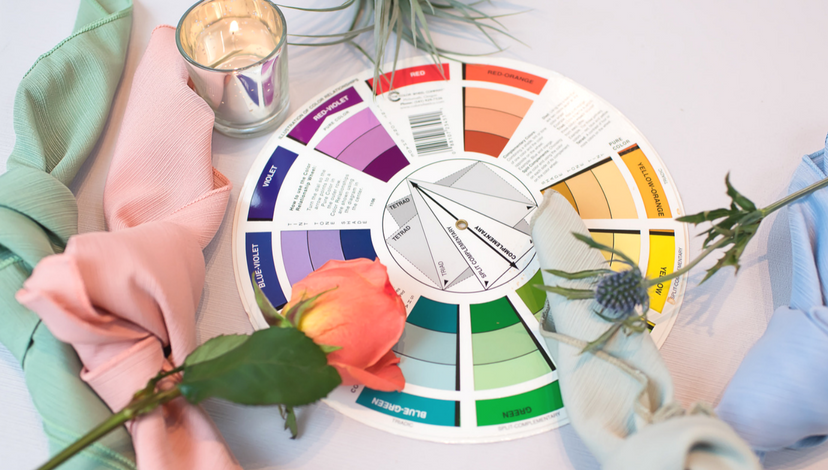
Color theory explores mixing colors in design, and the visual effects specific color combinations create. Color harmony describes an attractive arrangement of colors both pleasing to the eye and engaging to the viewer. Using color theory and color harmony to guide your event design creates an inner sense of order, a dynamic symmetry.
Our Faille collection offers hues from every part of the color wheel, enabling you to create beautiful and impactful tables using these time-tested theories and design guidelines. Follow us on this journey through color theory and color harmony.
Monochromatic
Monochromatic color schemes combine colors in differing shades of the same hue. This scheme looks clean and elegant, the colors go well together producing a soothing effect. A monochromatic arrangement always looks balanced and visually appealing.
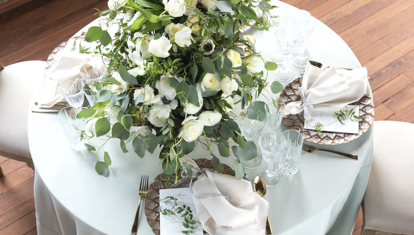
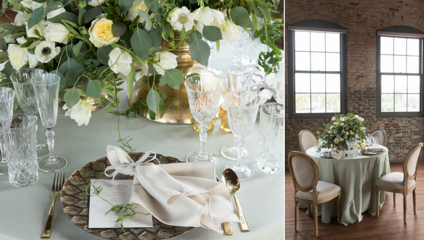
Succulent with Bone
 Justin Demutiis Photography | MMD Events | Armature Works
One of the most elegant expressions we have seen, Succulent faille is complemented by Bone faille napkins. It’s this simplicity — little color, but impressive floral centerpiece and ornate china and crystal — that take it to the heights in this upscale rustic space.
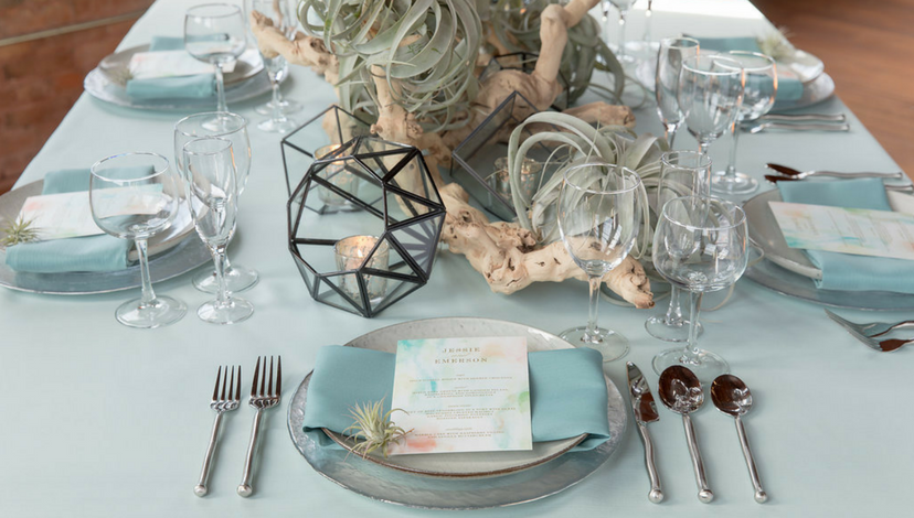
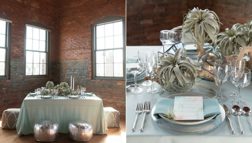
Sea Glass with Mineral
 Justin Demutiis Photography | MMD Events | Armature Works
Sea Glass. It could be watery grey — that’s the direction this unusual table setting goes. The addition of darker napkins, in Mineral faille, reflects the exotic centerpiece tone. And the seating? Well, those upholstered poufs prove there are no limits to creativity!
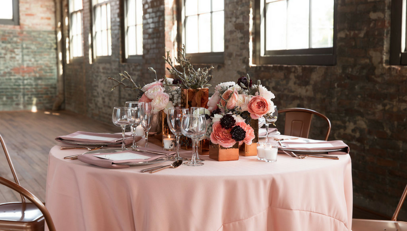
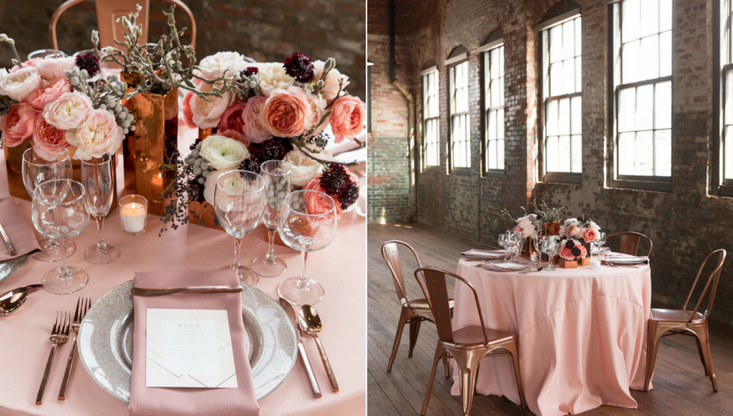
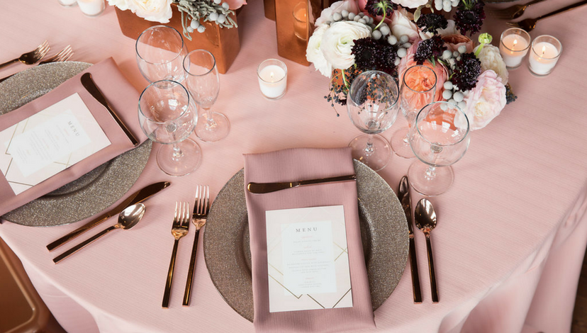
Salmon and Rosewood
 Justin Demutiis Photography | MMD Events | Armature Works
Burnished bronze, metal chairs, aged brick, bare floor — this is upscale rustic done right. Even the floral tones are a bit unexpected, and the impact is extraordinary.
Fig with Pewter
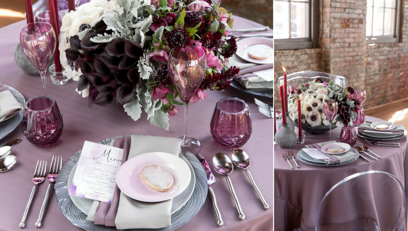
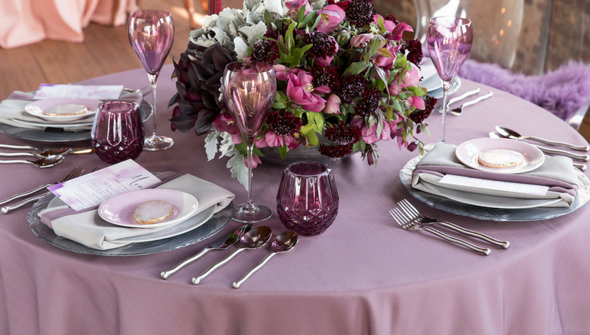
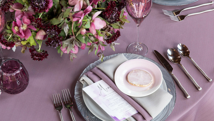 Justin Demutiis Photography | MMD Events | Armature Works
It’s a regal combination, elegant and restrained, but with a character that reeks of good taste and memorable occasions! Deeper tones of amethyst and blackberry only enhance the effect.
Complementary
Complementary color schemes combine colors across from each other on the color wheel. These combinations bring out the best in each other, creating interesting and attention-grabbing effects. This high-contrast scheme looks best when warm colors are paired with cool colors, use one as the dominant color and the other as the accent to highlight important design elements.
Honey and Lake
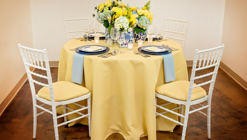
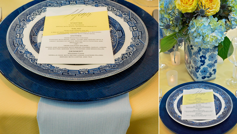 Suzanne Palasek Photography | Freesia
This complementary color scheme is lighthearted, casual, summery, and uncontrived. This is a table that is as right for a bridal luncheon as it would be for the Yacht Club’s “blessing of the fleet.” The deep blue charger and classic blue and white china add punch.
Analogous
Analogous color schemes combine colors adjacent to each other on the color wheel. One color is used as the dominant color while the others are used to enrich the look. This scheme has a nuanced feel that creates subtle intrigue.
Petal with Lake
 Suzanne Palasek Photography | Freesia
Petal may be hard to describe, but you can’t ignore its presence. It’s full of character, speaks of romance, and is perfect when paired with Lake napkins. It’s all played off against white.
Slate and Sea Glass
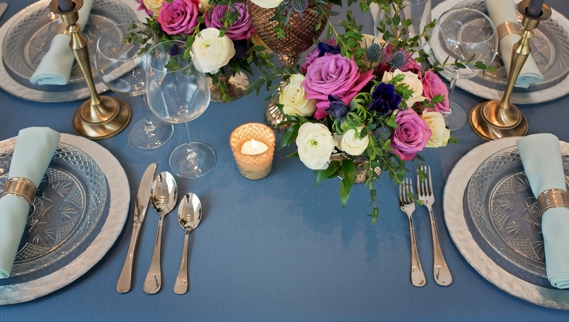 Suzanne Palasek Photography | Freesia
Slate is another adaptable blue-grey neutral that exhibits multiple personalities depending on what you pair it with. Here the pale character of Sea Glass brings out its blue side and colorful blooms keep it fresh and uncomplicated.
Triadic
Triadic color schemes combine three colors equally positioned on the color wheel. This vivacious scheme is popular because it offers strong contrast, yet still maintains balance and color richness.
Latte and Clay
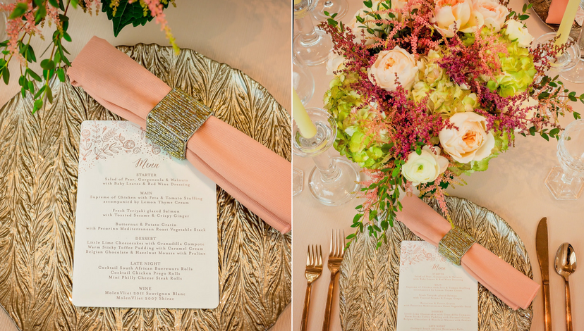
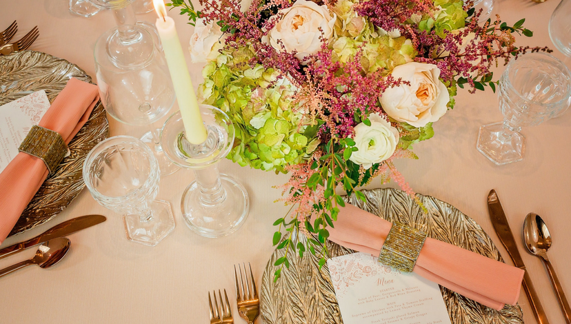 Suzanne Palasek Photography | Freesia | Minted
Latte derives from the jumbled, greed tones of a mix of shells on the beach. It imparts a warm, earthy glow to the tabletop, livened ever so keenly by the appearance of a napkin that underscores the spring tones of the floral centerpiece with precision.
While color theory and color harmony are great foundations to event design, rules are meant to be broken. Let your creativity flow with the huge variety in our Faille collection! Discover more of the color combinations in the Faille Lookbook.