An unexpected yet very chic combination makes up our August Color Crush. Bluesteel and Apricot Orange excellently pair for stunning designs.
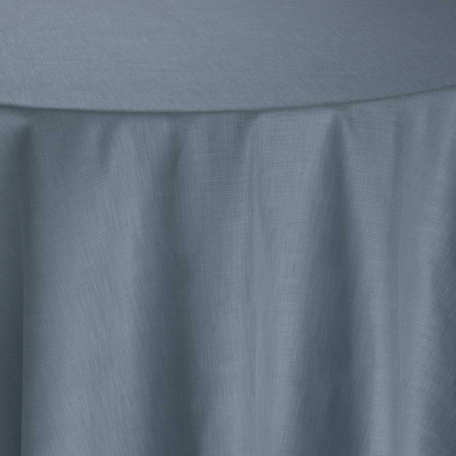
Bluesteel
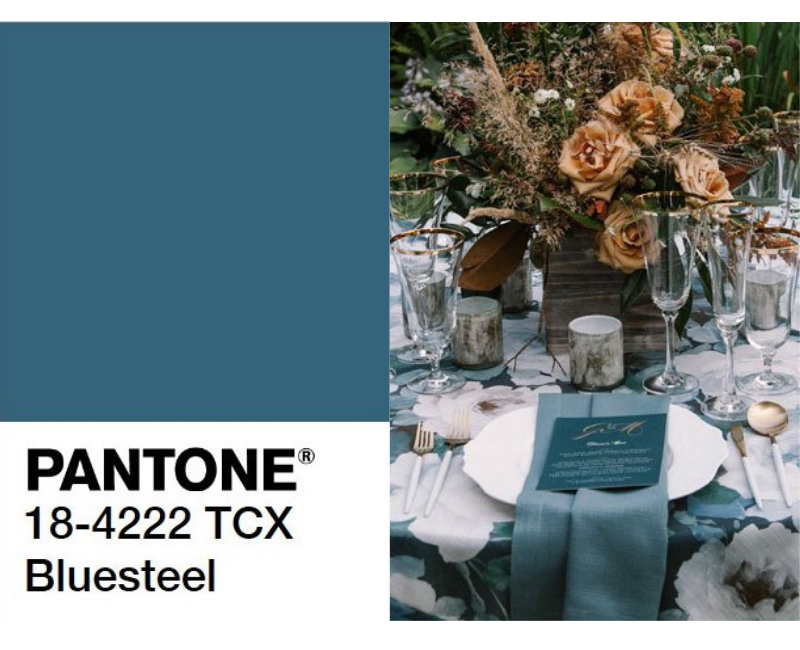
pantone.com | Floral: Diamond Event Floral, Photography: Clane Gessel International Wedding Photography, Venue: Bella Luna Farms, Linen: Como Eden table linen and Stonewash Sonoma napkin
As the most dominant color in our natural habitat, shades of blue are the most globally accepted color range. Bluesteel exudes a feeling of calmness and draws its name from the appearance of steel after it has undergone the “bluing” process to prevent rusting. Although this color is traditionally masculine, it is very versatile. It can be used as a statement color when paired with neutral or grey tones. This color works wonderfully on its own to add richness without being overpowering. On the other hand, it can be used more passively when it is paired with bright colors. Because Bluesteel falls between light and dark blue, it complements bright colors by toning them down.
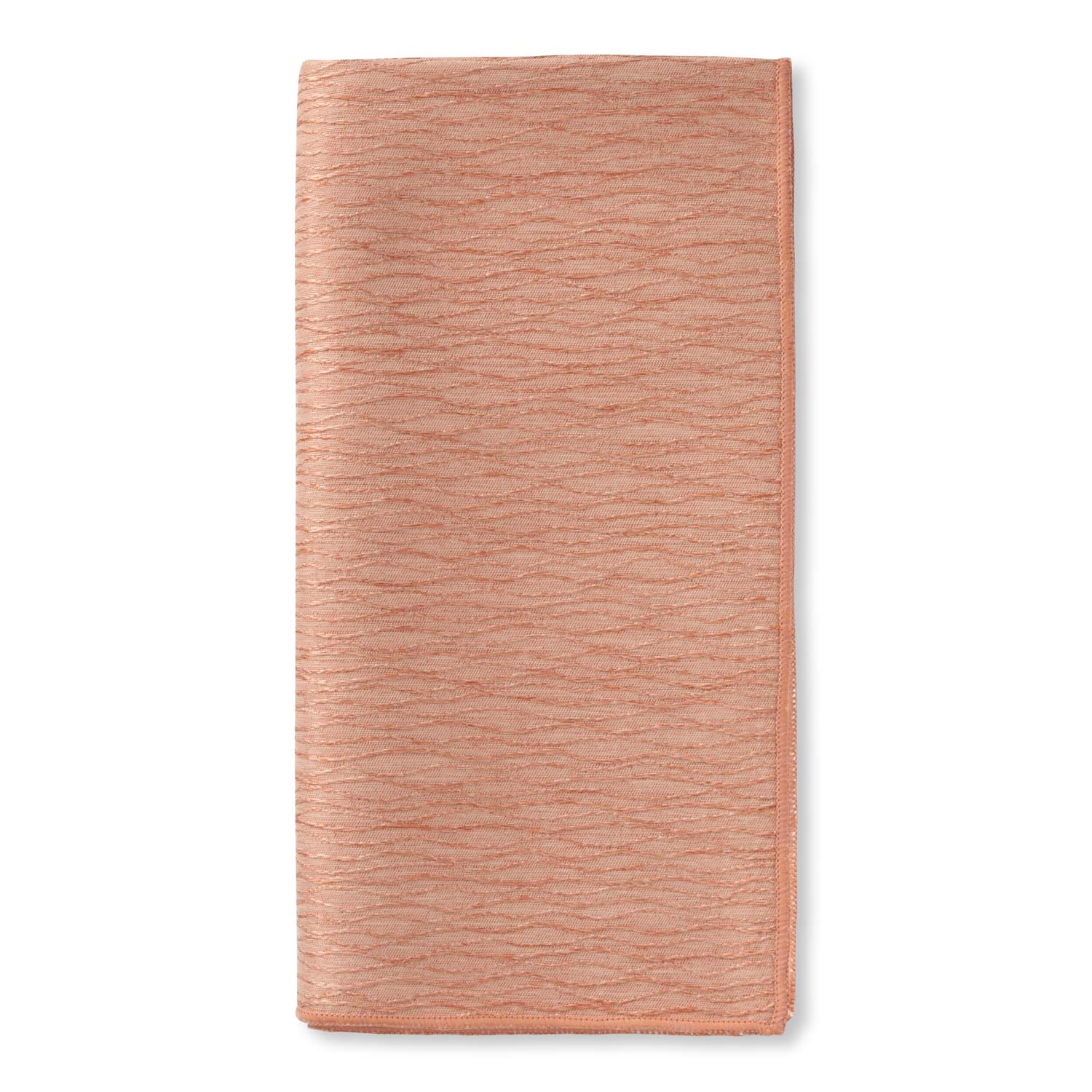
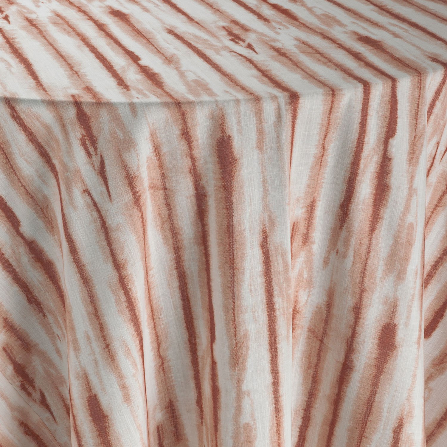
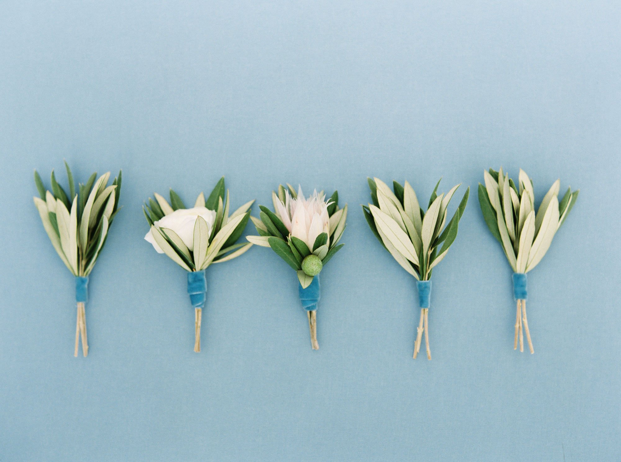
Apricot Orange
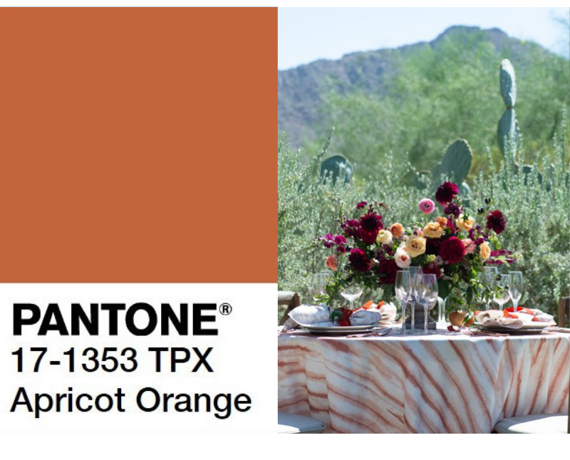 pantone.com | Floral: The Wildflower AZ, Photography: Cameron Clark, Venue, El Chorro, Linen: Sierra Drift
Apricot Orange brings soft warmth and energy. Pantone refers to Apricot Orange as “provocative, innovative and individualistic”. The color orange is a reminder of the setting sun, which often contains shades of apricot. This softer shade is perceived to be less overwhelming than its more vibrant counterparts because of its muted tone. Apricot Orange is great to transition into Fall as an homage to harvest time and the changing leaves. This warm yet subdued color catches the eye as an inviting addition to any design.
Pairing
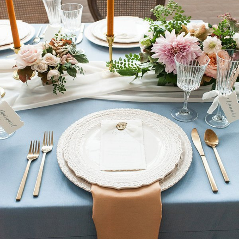
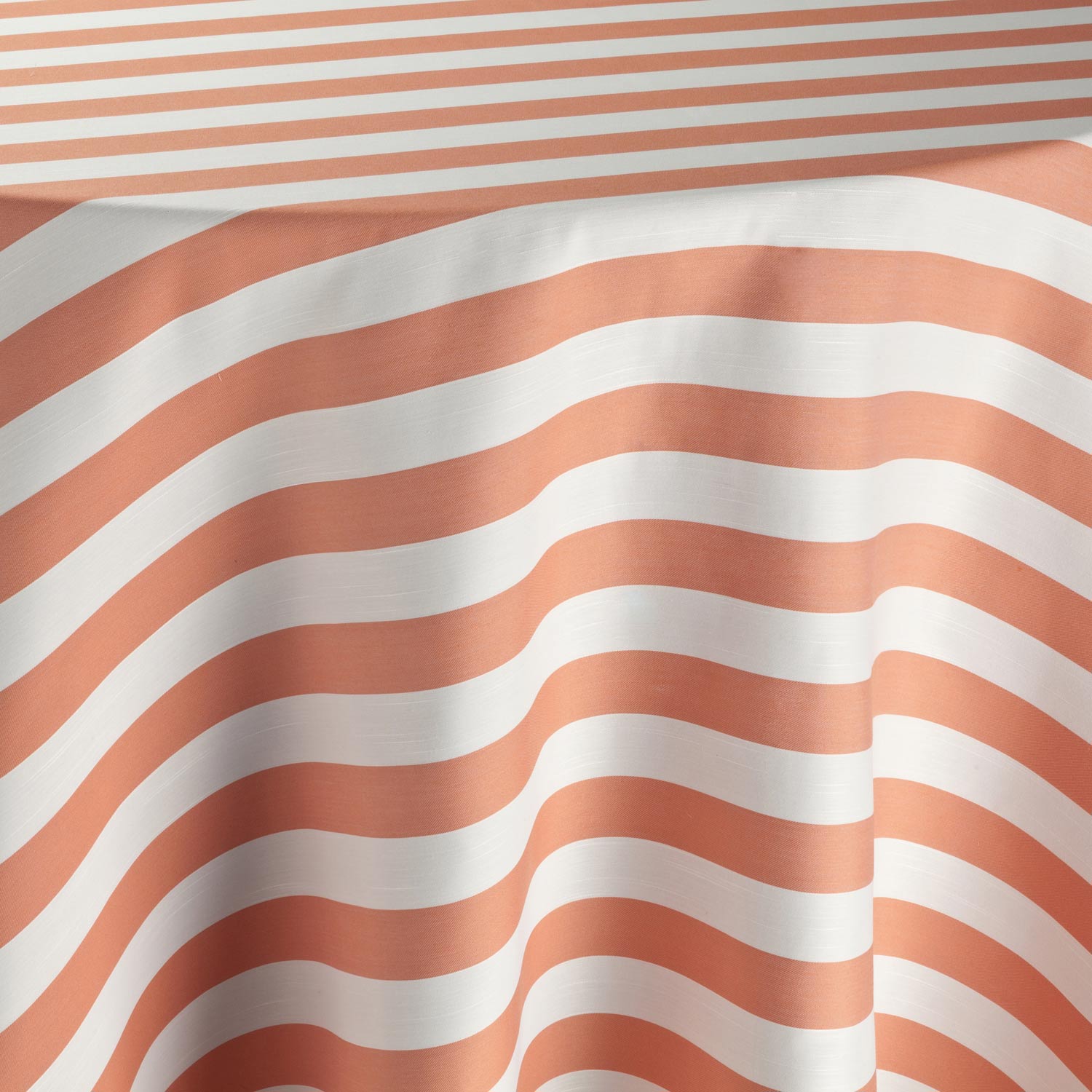
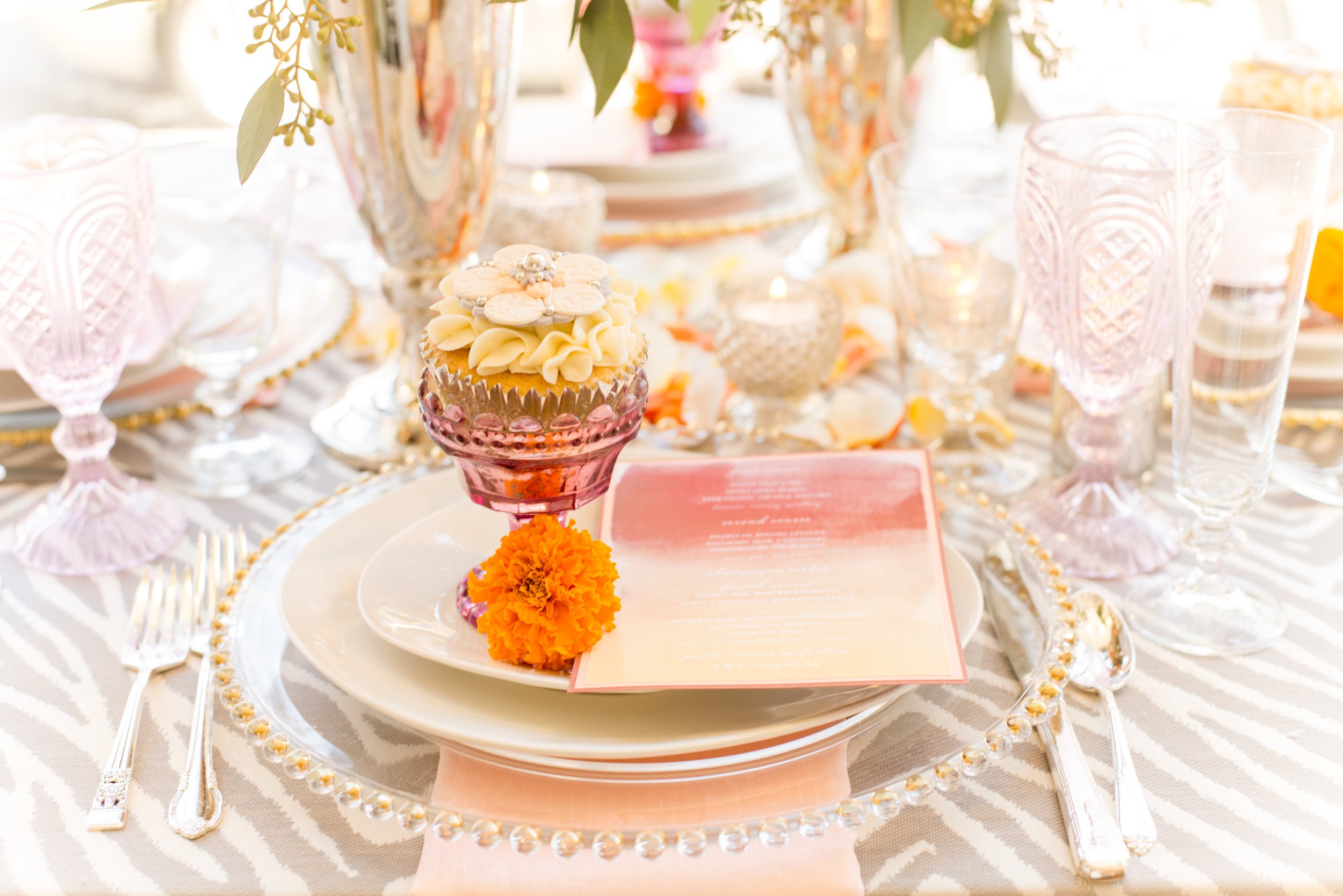
Photography: Lynne Reznick Photography, Planner: Urban Soiree Boston, Venue: The Boylston Rooms, Linen: Raine Faille table linen, Ivory Graceful table runner and Amber Shantung napkin
Bluesteel and Apricot Orange are opposite on the color wheel. Opposite colors work well together because they play on each other to create high contrast and high impact. This is the same reason Christmas colors, red and green, work together so nicely. Complimentary colors are pleasing to the eye because they create balance. In this combination, the brightness of Apricot Orange is toned down with the coolness of Bluesteel. This produces a relaxed feel while still using unique and interesting colors.
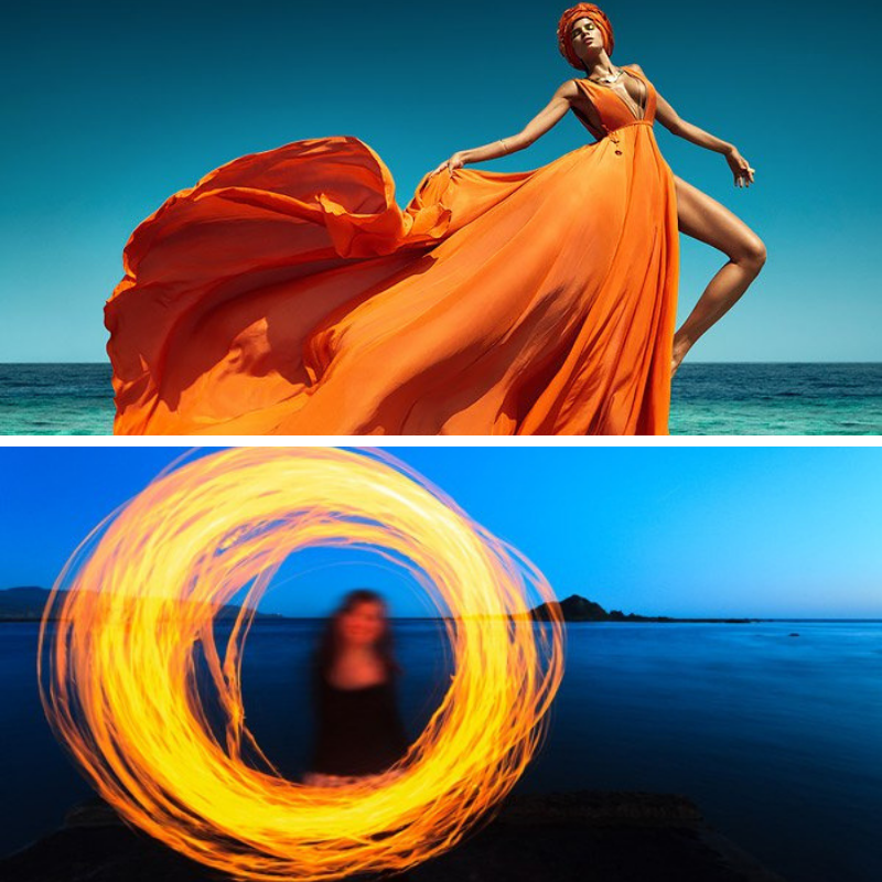
In Fashion
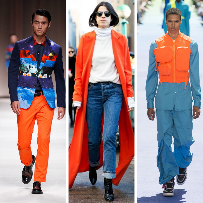
vogue.com | becomechic.com | vogue.com
Designers in the fashion industry use this unexpected color combination to create intriguing outfits. Orange is a bright color that attracts attention, while blue is a complementary color that ideally tones down the brightness and harmonizes other shades. When wearing these colors, outfits are designed with blue as neutral with pops of orange in vests, overcoats, and accessories.
Interior Design
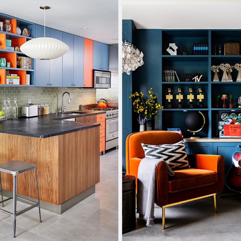
decoist.com | hdeco.net
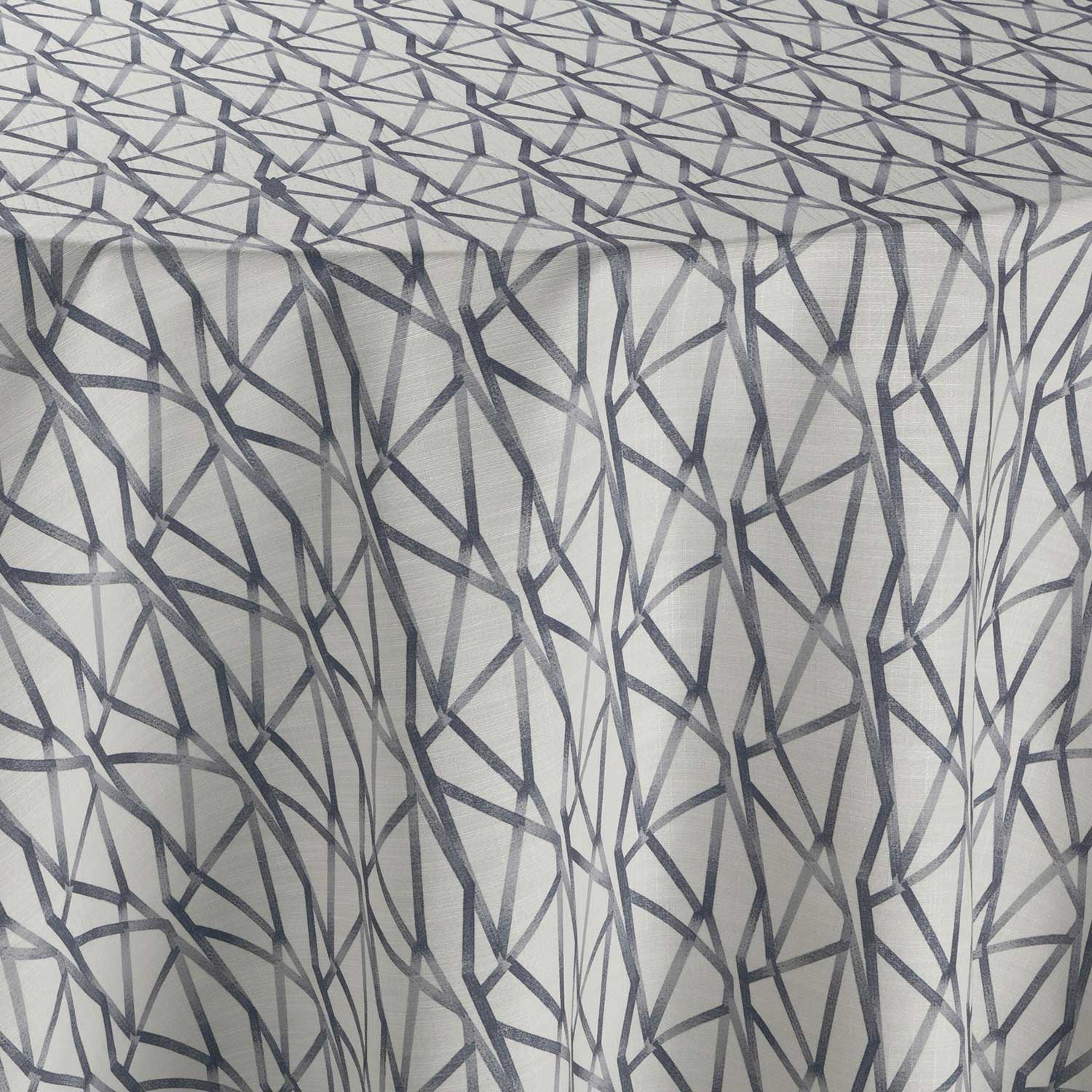
Apricot Orange and Bluesteel pair well in the home. The serene nature of Bluesteel and vibrancy of Apricot Orange are a great combination for a modern design. The earthy orange tone of Apricot paired with Bluesteel creates an earth and sky or land and sea concept that many designers value. A more muted orange, such as Apricot, is perfect for home décor and accent walls. Bluesteel can also be paired with whites and lighter colors to brighten a look, or dark tones to accent the grey nature of the color. This color combination is often accompanied by geometric patterns and modern décor. Orange is known as an appetite stimulant because of its association with food, so this pairing works brilliantly in kitchen décor. This pairing can also work well in creative spaces such as children’s rooms or home offices because of its lively yet comforting nature.
Photography
theinspirationgrid.com | digital-photography-school.com
Apricot Orange and Bluesteel are a combination often used in photography. Photographers frequently use color contrast to create dynamic and engaging photographs. Because these colors play on each other so well, photographers like to use them together for appealing and eye-catching shots or to highlight a single spot in a photograph.
Event Design
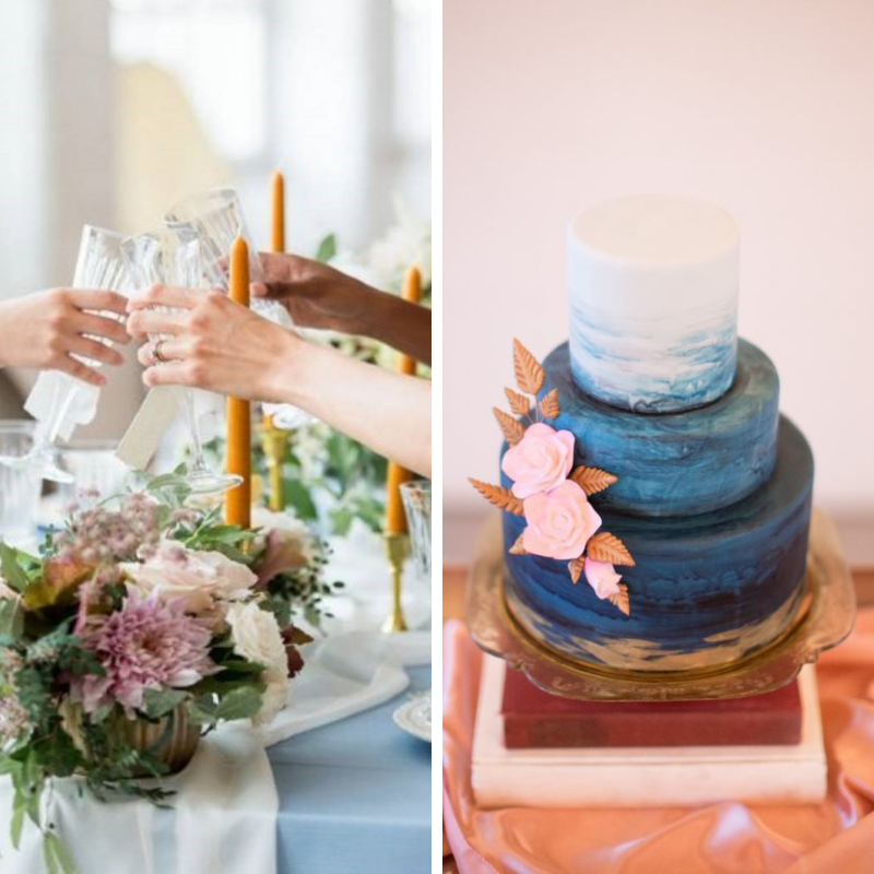
Photography: Lynne Reznick Photography, Planner: Urban Soiree Boston, Venue: The Boylston Rooms, Linen: Raine Faille table linen, Ivory Graceful table runner and Amber Shantung napkin | Photography: Vanessa Smith Photography, Venue: Prospect House
Much like in home décor, event designers like to use orange and blue combinations. Orange colors turn decor accessories into striking details that define the mood of the event while blue creates a base to build upon. This combination is often used for fun events such as baby showers. They can also be used in an upscale way with muted tones, like in Apricot Orange and Bluesteel, for more corporate or formal affairs.
The striking combination of Apricot Orange and Bluesteel is perfect for this month’s color crush to welcome the Fall season. We can’t wait to see how you’ll use this great combination for the upcoming season.
Shop this look