Sometimes, two colors are just destined to be partners — best friends forever, if you will. Black and White are like that. So are red and green, at least in most people’s minds.
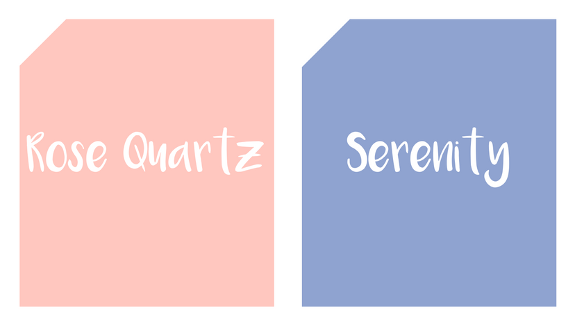
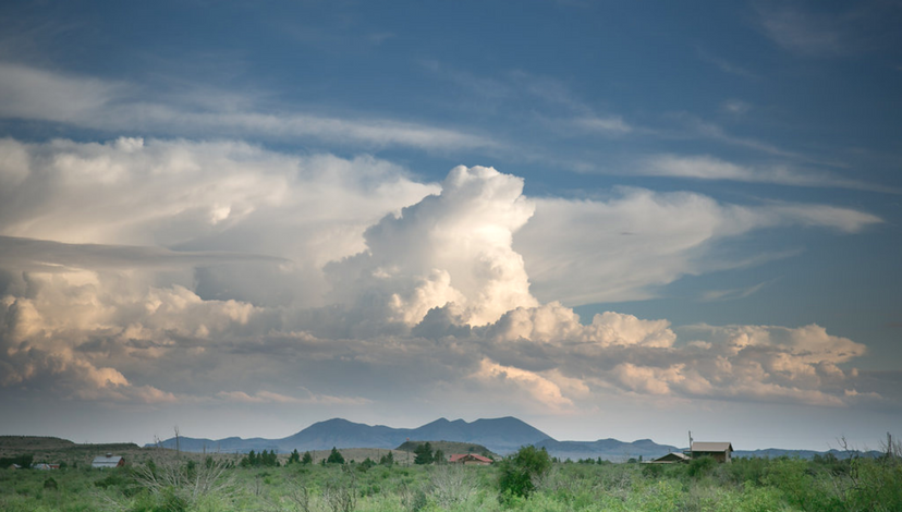
Rose Quartz and Serenity, the Pantone color choice for 2016, are natural partners as well. They appear together at sunrise and sunset, in floral displays and award-winning artwork. They are favorites worldwide. They are associated in our minds as the balance of warm pink and cooler blue, of harmony and wellness, of order and peace, according to Pantone, the color experts of the fashion world and a global influencer in design.
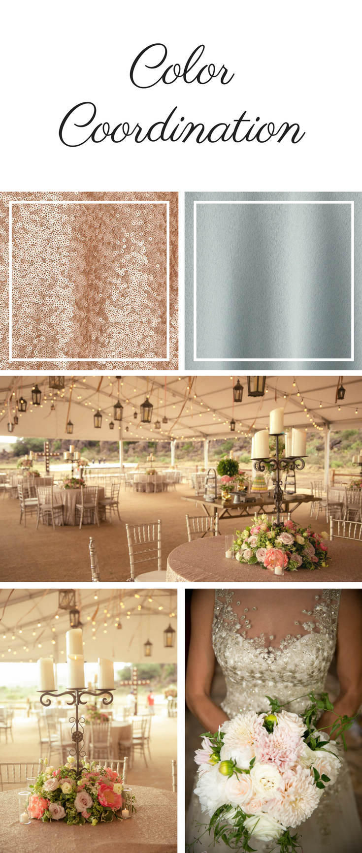
Perfect Choice for a Chic Outdoor Wedding
 Steve Wrubel Photography | Florist and Designer: Jackson Durham
Choosing two hues as a single “Color of the Year” was unusual, explained by Pantone as a way to respond to changing times. Fluidity of expression, gender equality, a new approach to expression, and an open exchange of ideas and information are all said to characterize the pairing. Rose Quartz, “a persuasive yet gentle tone that conveys compassion and a sense of composure,” and Serenity, a blue that brings “feelings of respite and relaxation even in turbulent times,” do indeed seem made for each other.
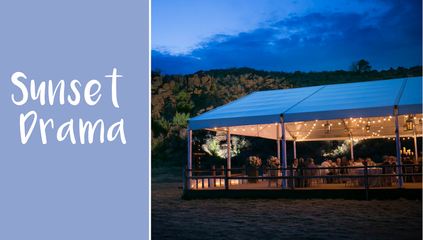
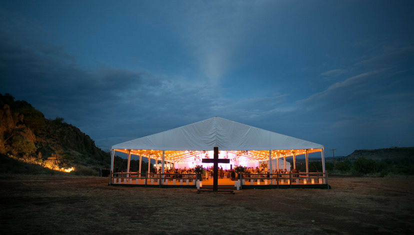
Sunset Drama
 Steve Wrubel Photography | Florist and Designer: Jackson Durham
These colors — Rose Quartz and Serenity — seem the perfect choice for an evening wedding with a backdrop of blue sky and the rosy glow of a tent set on the open prairie.
Capitalizing on Nature
 Steve Wrubel Photography | Florist and Designer: Jackson Durham
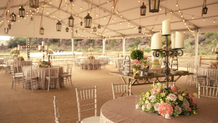
When the beauty of the outdoors surrounds your event, it’s wise to keep the decorations simple and allow the focus to be on the beauty of nature. Here, the rosy floral centerpieces are the only colorful intrusion in a classic setting of elegantly skirted tables, simple chairs and twinkling overhead light strings, lanterns and candles in iron candelabra.
Harmony of Tones
 Steve Wrubel Photography | Florist and Designer: Jackson Durham
The floral tones have just the right amount of variety to keep it lively, but they all complement the of the Rose Quartz hue, offering a counterpoint to the serenity-toned sky above and the fields beyond.
{{cta(‘d7eefbbc-e31d-4d5f-a1d5-5877d3cdf5e5′,’justifycenter’)}}
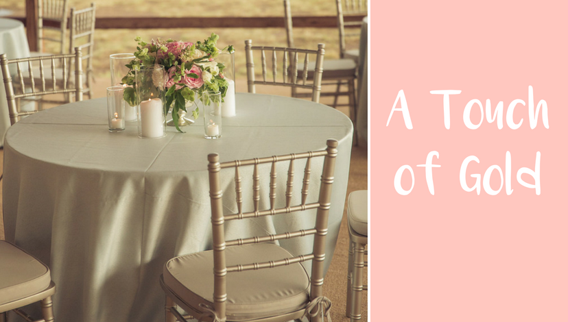
A Touch of Gold
 Steve Wrubel Photography | Florist and Designer: Jackson Durham
Even though it might be a natural inclination to add layers of color and stronger tones in this outdoor setting, the restraint of using only a single tone and using it sparingly creates a stunning effect.
A Whiter Shade of Pale
 Steve Wrubel Photography | Florist and Designer: Jackson Durham
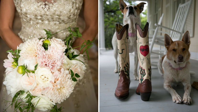
The gorgeous bouquet, with just a hint of rose, is a perfect complement to a gold-trimmed wedding gown.
 Steve Wrubel Photography | Florist and Designer: Jackson Durham