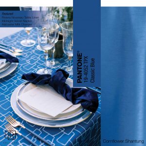
The announcement of Pantone’s Color of The Year is an established tradition that sets into motion a cavalcade of enthusiasm reverberated across multiple industries. This year’s color, announced on December 4th, is Classic Blue.
 pantone.com | Photographer: Charla Storey Photography Floral: Florals by David Kimmel Design Rentals: Posh Couture Rentals Venue: Modern Art Museum of Fort Worth
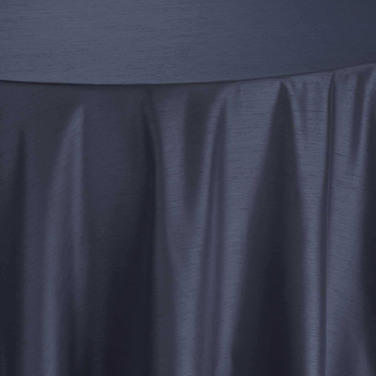
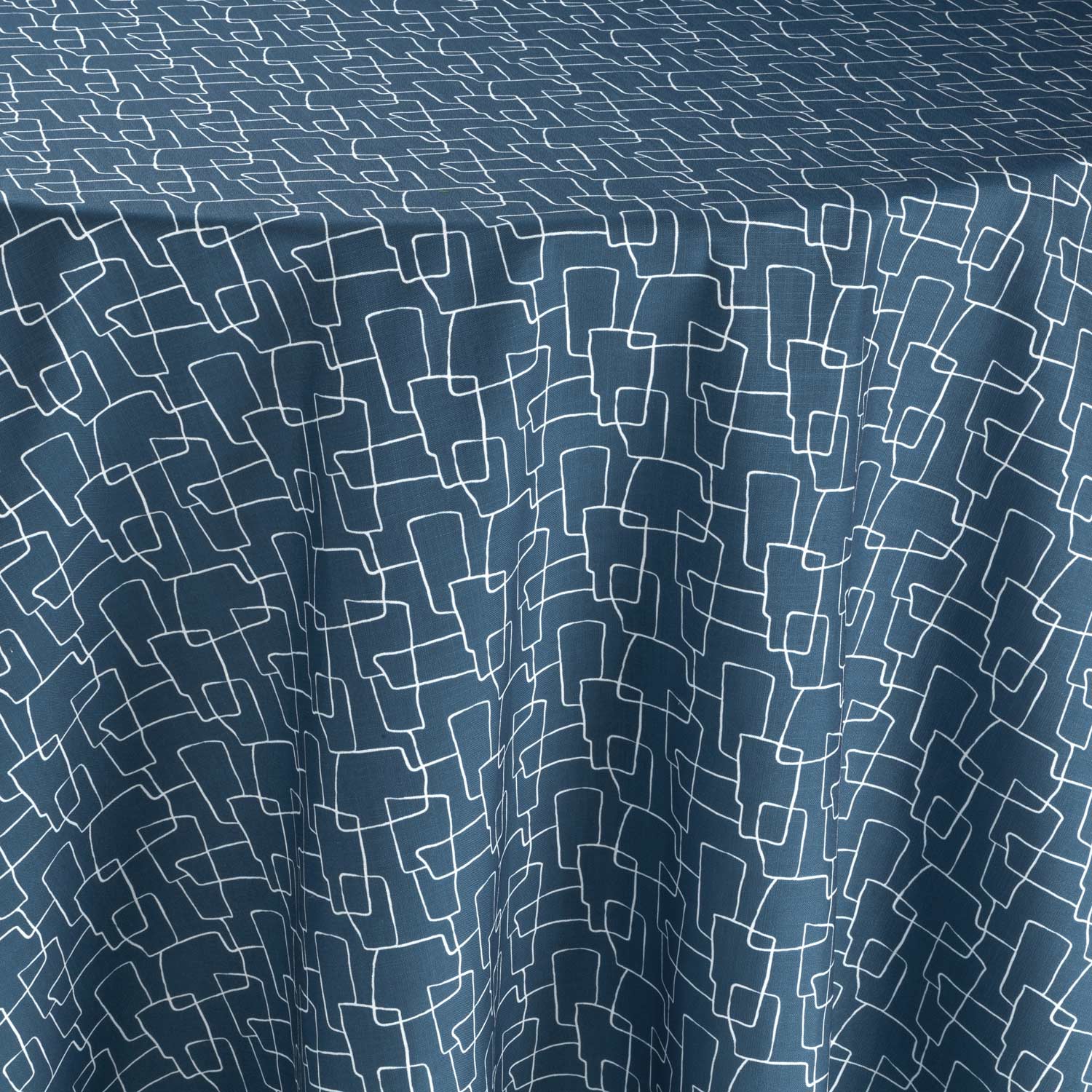
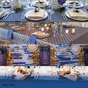
Linen: Riviera Nouveau Table Linen Napkin: Midnight Velvet Charger: Alabaster Milk Charger
A universal favorite amongst individuals and businesses. Blue is the only primary color on the cool spectrum. So it’s easy to understand why it is one of the most popular color choices. Classic Blue can express trust, authority, and confidence, which makes it the preferred color for suits in the corporate world and the uniforms for law enforcement.
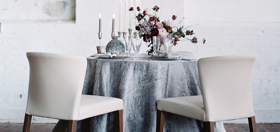
Pairing
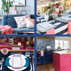
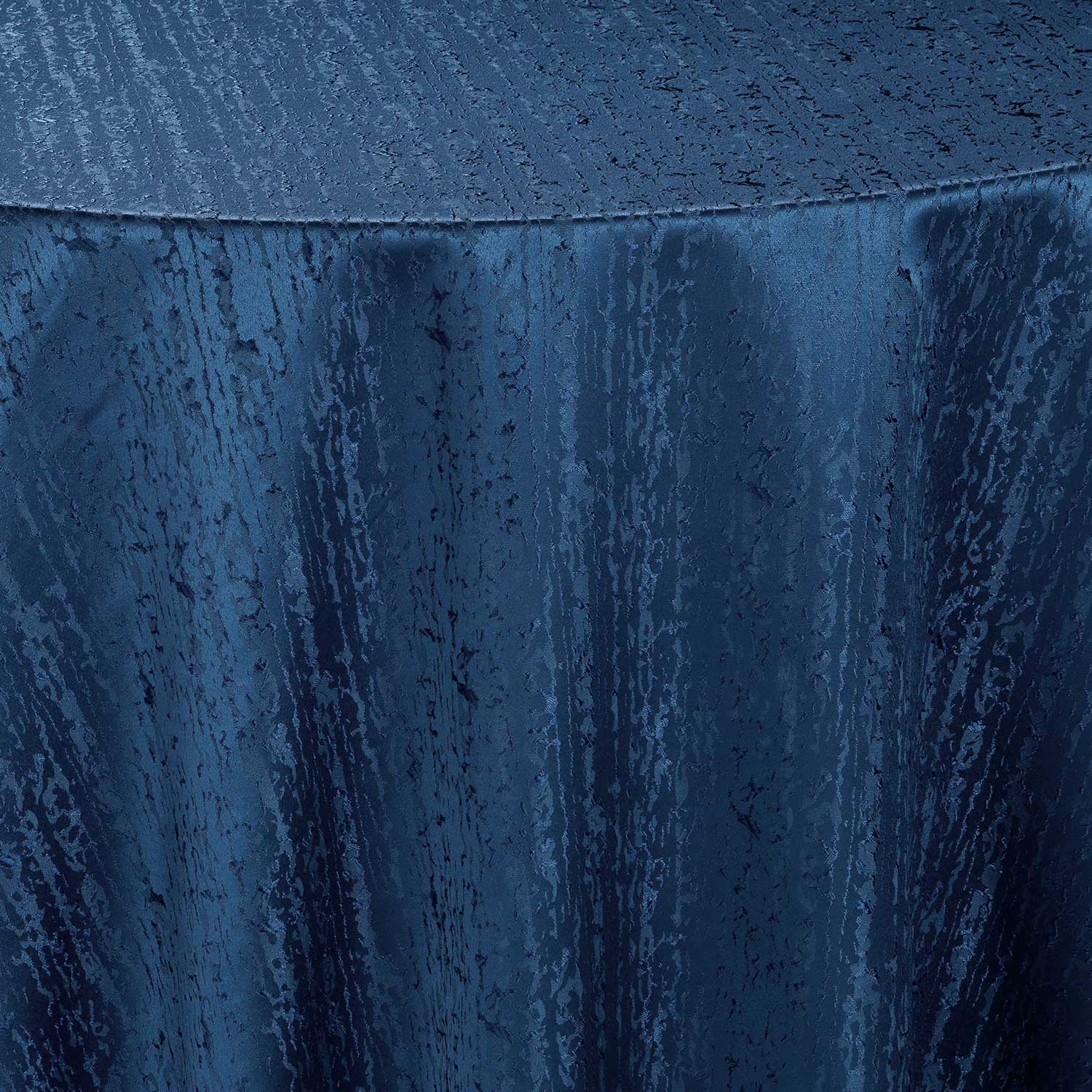
Top Left: West Elm | Top Right: Tara Brown Photography, Bash & Bloom, Lemonade Letters, Grand Event Rentals, Vintage Ambiance | Linen: Navy Mod Stripe Napkin: Coral Lamour
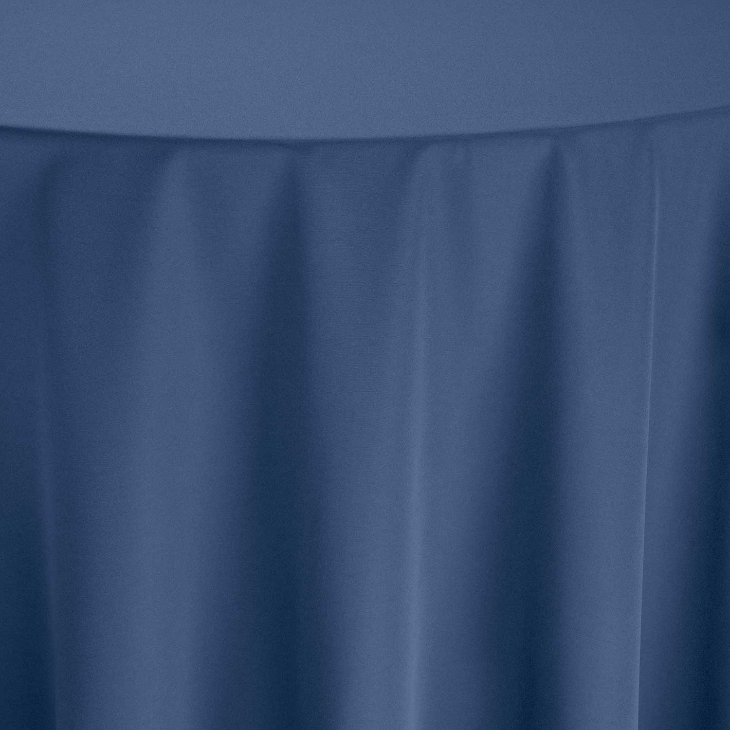
Bottom Left: Front Room Studios | Overlay: Del Sol, Linen: Navy Lamour Napkin: Caspian Twill | Bottom Right: Parlour Farms
Looking for Inspiration


In Nature

An abundant color found in nature, it is the color linked to water and the sky but is a color rarely found in fruits and vegetables. A color often used to illustrate being cold or wet.
Interior Design
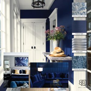
Benjamin Moore, Greg Natale, Boca Do Lobo | Linen: Oxford Hidden Garden, Federal Faille, Edgewater, Riviera Nouveau
In design, the exact shade of blue you select will have a huge impact on how your designs are perceived. Classic Blue’s hue is a very versatile tone that can be matched with absolutely anything.
Fashion
One of the most contradictory colors, the symbolism of blue is largely affected depending on the exact shade and hue. Most blues have naturally calming qualities instilling stability and dependability. In stark contrast, blue is also a symbol associated with depression. However, finding itself in the center of the blue spectrum, Classic Blue is considered a friendly, calming color.
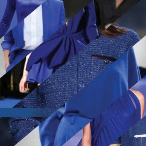
Boston Globe | The Telegraph | Evening Standard | Glowsly | Miss Rich | Cristinahh | Getty Images
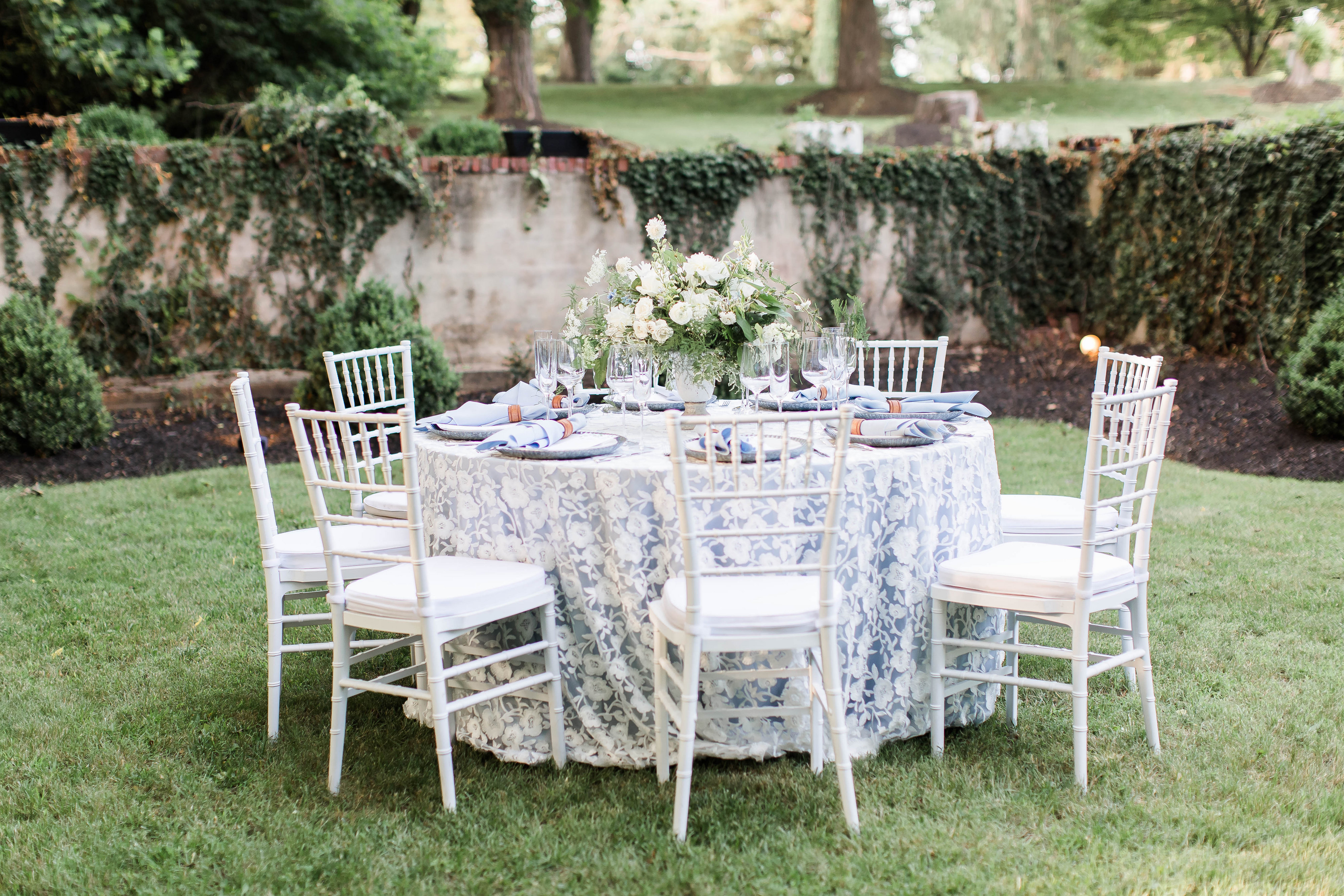
Event Design
Top: Top of the Garden, Gloria Dawson, and Please B Seated | Linen: Federal Shantung, Napkin: White Shantung, Charger: Reflex Silver Glitter
2nd: Elena’s Garden, Carasco Photo & Video, Bridgeport Art Center Sculpture Garden | Linen: Sea Adorn, Napkin: Federal Shantung, Charger: Ice Clear with Gold
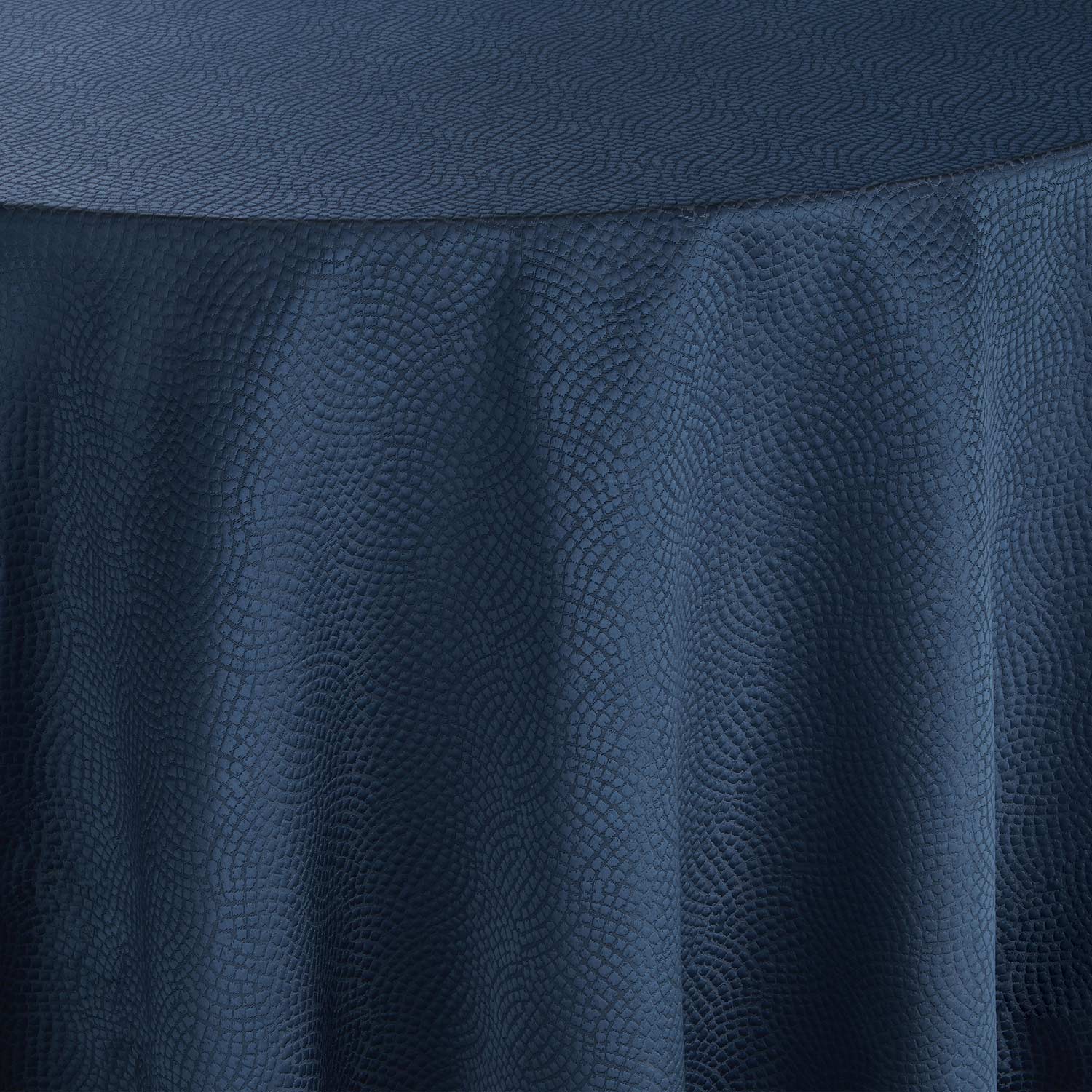
3rd: Thisbe Grace Photography, Diamond Affairs, Perch Décor, The Filter Building, | Linen: Blue Brushstroke, Napkin: Federal Shantung, Placemat: Gold Edge Metal
Bottom: BDP and Tablescapes | Linen: Midnight Velvet, Runner: Bronze Jacks, Napkin: Golden Bengaline
Whether you want to capture the essence of spring or are looking ahead to great summer trends, our color crushes will help you create an unforgettable event. Check out our Pinterest for inspiration and the latest trends. We know you have many more creative ideas, so tag @BBJLinen on Instagram using #JanuaryColorCrush to show us how you’ll use this month’s Color Crush. For more of our Color Crushes, check out our previous Color Crush blog posts.
Shop this look